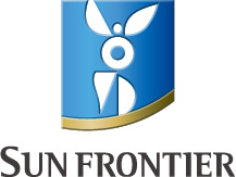
Company Name : Origin of SUN FRONTIER
The sun is both the ultimate symbol of radiant vigor and love showered upon all; an emblem of the spirit of altruism. "Frontier" represents a venture spirit to forge a way ahead with constant positivity and belief in our potential. It embodies an attitude to continually strive to create value.
The name "Sun Frontier" contains our intention to work with a continual radiant vigor for the well-being of humankind and society. To that end we wish to be a company whose staff can pursue their own dreams and challenge new things.
Origin of Logo

In April 2014, we introduced this new symbol mark. We aim to grow further in order to offer the best personal services to individual customers and contribute to them more deeply. While inheriting the altruistic spirit, which has been cherished so far, we have infused this symbol with the hope of improving our reliability and dignity as a professional who contributes to the happiness of each customer.
Shape
The curve of the emblem depicts a scene in which the altruistic spirit illuminates the horizon and brings development to humankind and society. The unbounded design of a person is inherited from the previous logo, and represents unique solutions and continuous growth.
Color
The blue represents sincerity, while the gold denotes affluence and dignity.
Font
This font represents the reliability supported by high technological capability, forward-thinking spirit, and the ability to take action.
